Toggle navigation
Login
Sign Up
Courses from Think Outside The Slide to help business professionals create effective presentations
Enroll now
Featured Courses
Guided self-study course to create more effective PowerPoint presentations
Available until
Dave Paradi
%
COMPLETE
$199
Excel Chart Skills 501
Available until
Quickly learn expert-level Excel techniques to create presentation-ready charts that are easy to update and re-use without programming, add-ins, or web tools
Dave Paradi
%
COMPLETE
$249
FinancialViz Message-based Dataviz Chooser
Available until
Choose the right visual for financial results and analysis based on the message you want to communicate
Dave Paradi
%
COMPLETE
$99
PowerPoint skills for effective sales presentations
Available until
Dave Paradi
%
COMPLETE
$189
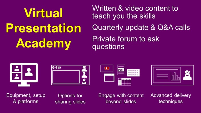
Virtual Presentation Academy
Available until
Dave Paradi
%
COMPLETE
$500